chloelim studio
Explore selected work
A collection of product, UX, and visual design work that transforms research, data, and user insights into intuitive experiences through strategy, collaboration, and continuous iteration.


SOTI JAPAN WEBSITE REVAMP
Redesigning a Localized Web Experience
for the Japanese Market
Improving navigation, trust, and conversion through research-led localization.

Context & Challenge
The Japan market website was originally built from a global enterprise web model, but its performance suggested that the experience was not fully aligned with how local users evaluated information, navigated content, or built trust with the brand. The challenge was not simply to refresh the visual design. It was to understand what was preventing Japanese visitors from moving confidently through the experience and to redesign the website around clearer navigation, stronger content structure, and a more culturally relevant look and feel.
Role & Collaboration
As the UX/UI Designer on the project, I led the visual direction and navigation redesign while collaborating with a cross-functional team across research, sales, and development. Our team conducted market research, competitor analysis, data review, client interviews, and card sorting to better understand how users expected information to be organized. I also contributed to the client interview questions and helped translate the research findings into a clearer content structure and redesigned landing page experience.
Key Insights
Through discovery, we found that the existing website reflected a more Westernized enterprise structure: minimal context, simplified content hierarchy, and broad messaging. However, the Japanese market required a different approach. Users needed more localized context, stronger trust signals, clearer navigation pathways, and visual cues that felt familiar within the Japanese enterprise technology landscape. Competitor research also showed that leading Japanese brands often presented information with more detail, layered content, and credibility-building elements before asking users to take action.
Research methods
-
Client interview question planning
-
Stakeholder input analysis through sales representatives
-
Market research
-
Competitor analysis
-
Data analysis
-
Card sorting
-
Content audit
-
Navigation restructuring
-
Visual localization
Design Approach
The redesigned experience focused on reorganizing the content architecture, improving navigation clarity, and creating a look and feel that better matched local expectations. The goal was to make the website easier to scan, easier to trust, and easier to act on. After launch, the revamped Japan website saw a 100% increase in traffic and contacts, along with a 30% lift in conversion.
Design response
-
Reorganized navigation based on card sorting and content priorities
-
Restructured landing pages around clearer decision paths
-
Increased localized trust cues and credibility signals
-
Adjusted the visual system to better align with Japanese enterprise web expectations
-
Created high-fidelity mockups for key landing pages
Reflection
This project reinforced one of my core design principles: the right solution starts with finding the right problem. In this case, the problem was not that the website looked outdated. The deeper issue was that the experience had not been designed for the cultural, behavioural, and decision-making context of its market.
MANULIFE GROUP BENEFIT TRANSITION
Designing a Segmented UX Journey for Group Benefits Transition
Helping customers understand their options and confidently move from group benefits to individual coverage.
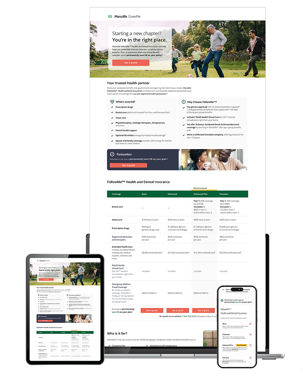


Context & Challenge
The Group Benefits Transition experience was created to support customers moving from employer-sponsored group benefits into individual insurance coverage. The acquisition journey did not begin on the landing page alone. It started earlier through direct billing and LIA communications, then continued into the landing page experience, where users were expected to understand their options and take action.
The challenge was to redesign this customer journey as a connected acquisition experience rather than a single webpage. Based on past data, user verbatim data, and channel performance, we identified an opportunity to rethink how different customer segments should be guided across touch-points. Age, life stage, channel behaviour, and intent all influenced how users entered the experience, what information they needed, and how confidently they moved toward a quote.
Key Insights
The research showed that users were not entering the experience with the same needs or mindset. Some customers needed reassurance and education around losing group coverage, while others were closer to taking action and needed a faster path
to compare options or start a quote. This meant that a single generic journey would not serve every audience equally.
We also learned that channel behaviour mattered. Direct mail and landing page visitors required different segmentation strategies because each touchpoint played a different role in the acquisition journey. Direct mail needed to quickly establish relevance and urgency, while the landing page needed to support deeper understanding, comparison, and action.
Data also showed that a significant portion of traffic came from mobile devices, which shifted the design priority. The experience needed to work especially well on iOS and Android, with clear content hierarchy, accessible tap targets, simplified page structure, reduced cognitive load, and CTAs placed where users could easily find and act on them.
Competitor and heuristic reviews reinforced the need for a clearer value proposition, stronger guidance, and a more focused mobile journey. The key issue was not only how the page looked, but how well it helped users understand their situation, recognize the right next step, and continue toward individual coverage with confidence.
Research methods
-
Heuristic evaluation
-
Competitor analysis
-
User data and partner insights review
-
Hypothesis development
-
Usability testing
-
Behavioral observation
-
Insight synthesis
-
AI-assisted research support
-
Validation through testing and stakeholder alignment
Design Approach
The redesign focused on creating a segmented, mobile-first acquisition experience that connected the broader journey across direct billing, LIA, and landing page touchpoints. Instead of treating all users the same, the experience was shaped around age, life stage, channel intent, and readiness to act.
After finishing the research, I created wireframes that prioritized content clarity, progressive disclosure, and stronger decision support. The mobile experience was designed first, with simplified page sections, scannable content blocks, accessible CTAs, and layouts that worked naturally across iOS and Android. The goal was to help users quickly understand the offer, recognize its relevance, and move forward without unnecessary friction.
Because the experience had to live across both AEM and React environments, the design also needed to balance consistency with implementation realities. For the Manulife page, I applied the AEM design system and established corporate patterns. For the CoverMe page, I adapted the experience to React-based components while maintaining brand and journey continuity between the two environments.
After the initial design direction was developed, I planned and conducted usability testing to evaluate whether users understood the offer, trusted the information, and knew what action to take next. Insights from testing were synthesized into key themes and applied to the next design iteration, improving content hierarchy, CTA clarity, and mobile usability.
Design response
-
Introduced a segmented journey based on age, life stage, and intent to better guide users toward relevant actions
-
Designed a mobile-first experience with simplified layouts, clear hierarchy, and accessible tap targets
-
Collaborated with copywriters by focusing on content strategy and best-practice layout to improve clarity, trust, and usability
-
Optimized CTA placement and visibility to improve conversion and task completion
-
Applied the AEM design system and created reusable components that improved customer understanding across web and mobile pages
-
Ensured consistency across AEM and React environments while adapting to system constraints and enterprise workflows
-
Integrated usability testing insights to refine content structure, interaction patterns, and overall clarity
-
Leveraged various AI tools to enhance the design process, supporting research synthesis, content exploration, and iterative design while considering usability, trust, and clarity
Reflection
This project reinforced the importance of finding the right problem before designing the solution. The opportunity was not simply to update a landing page. The deeper challenge was to understand how different users moved through the acquisition journey, what they needed at each touchpoint, and how design could reduce friction across a complex enterprise ecosystem.
It also highlighted the value of AI as a design workflow partner. AI helped accelerate exploration, synthesis, and content structuring, but the final decisions still depended on research, usability testing, stakeholder alignment, and human judgment. For me, this project showed how modern UX practice can combine human-centered design, data-informed segmentation, AI-assisted workflows, and design systems to create experiences that are clear, trustworthy, and measurable.
Perconal Project
Helping Toronto Commuters Navigate Transit with More Confidence
A mobile UX concept for real-time transit prediction, route clarity, and safer multimodal travel.


Context & Challenge
Toronto transit riders rely on multiple sources to decide how to get from one place to another. The challenge is not simply finding a route, but making the best decision in the moment while balancing time, safety, reliability, and uncertainty.
This project explored how an AI-enabled mobile transportation tool could support more confident decision-making by combining real-time transit prediction, route comparison, and pedestrian-friendly navigation into one experience. The concept was designed as a “Waze for foot travellers,” focusing on how predictive insights and intelligent recommendations can improve usability, trust, and clarity in complex travel workflows.
Key Insights
I led the end-to-end design process, including problem framing, user flow development, information architecture, wireframing, prototyping in Figma, and visual interface design.
The project focused on translating user needs, behavioural insights, and system constraints into intuitive flows and scalable UI patterns. I also explored how AI-driven features could be integrated into the experience to enhance decision-making without overwhelming users.
Problem Framing
The core problem was uncertainty. Riders often do not know whether the next subway, streetcar, or bus will arrive on time, whether walking to another stop would be faster, or whether a suggested route will feel safe and practical.
Rather than designing another navigation tool, the opportunity was to create a decision-support system that helps users evaluate tradeoffs quickly. The experience needed to answer three key questions:
-
What is the fastest realistic route right now?
-
How reliable is this route based on predictive data and service conditions?
-
What is the safest and most comfortable path as a pedestrian?
This framing aligns with designing for complex workflows, where users must interpret multiple data points and make time-sensitive decisions.
Design Approach
The experience was designed as an AI-assisted decision flow that helps users evaluate and select routes based on real-time conditions and predictive insights.
Key design decisions included:
-
A route comparison interface highlighting fastest, safest, and most reliable options
-
AI-driven arrival predictions for subway, streetcar, and bus
-
Confidence indicators to communicate reliability and reduce uncertainty
-
Pedestrian-first navigation tailored to walking and transfers
-
Simplified transfer guidance to support complex multimodal workflows
-
Safety-aware route details such as walking distance, lighting, and street activity
-
A mobile-first interface optimized for quick, in-motion interactions
Designs were created in Figma, using reusable components and consistent UI patterns to simulate a scalable design system approach. This ensured consistency across screens and demonstrated how the product could evolve within a larger ecosystem.
AI tools were explored during ideation and prototyping to generate route scenarios, test variations, and refine interaction patterns. This helped accelerate exploration while maintaining a focus on usability and clarity.
UX Flow
The core experience followed a structured decision workflow:
-
Enter destination
-
Compare AI-recommended routes
-
Review predictive arrival times and reliability indicators
-
Evaluate tradeoffs between speed, safety, and effort
-
Select a route and follow step-by-step guidance
-
Receive real-time updates and alternative suggestions if conditions change
This flow was designed to support complex decision-making while keeping interactions simple and intuitive.
Reflection
This project strengthened my ability to design for complex, data-driven experiences and to think critically about how AI can enhance usability without compromising trust or clarity.
The key takeaway was that AI should not add complexity. It should simplify decision-making. By focusing on transparency, confidence indicators, and clear communication of tradeoffs, the design supports users in making informed choices quickly.
This experience also reinforced the importance of communicating design intent and rationale clearly, especially when introducing AI-driven features. Thoughtful integration of AI can add significant value, but only when users understand how and why it is being used.
Art Direction Across Touchpoints
Campaign Art Direction
This section highlights visual work across social, motion, video, editorial, and digital campaigns. Each project reflects a balance of creative direction, brand consistency, and production detail — translating strategy into visuals that connect with the right audience.
From concept to execution, design decisions were guided by audience context, platform behavior, and measurable communication goals.


Design system
Building a Tokenized Design System for Scalable, AI-Ready Experiences
Future-State AI Workflow. Improving consistency, efficiency, and AI-readiness across marketing communications.


Context & Challenge
Email marketing was a high-volume touchpoint, but production relied on one-off layouts, manual decisions, and inconsistent use of brand rules. As volume grew, this created inefficiencies and inconsistencies across teams. The goal was not just to create templates, but to build a scalable system that improves speed, consistency, and alignment with the broader design system.
Role & Collaboration
I proactively led the creation of a Figma-based email design system with reusable components, structured variants, and tokenized foundations.
I collaborated with designers, marketers, and developers to identify recurring issues and standardize patterns, aiming to create a shared system that balances flexibility with efficiency.
Design Approach
I focused on repeatable patterns instead of one-off templates. I identified common email structures and recurring UI decisions, then built a tokenized system in Figma. This included typography, colour, spacing, CTA patterns, layout modules, and responsive behaviour.
To support AI-ready workflows, I structured components and tokens in a way that could be easily interpreted by automation tools. This enables future integration where AI can suggest layouts, generate content variations, or assemble emails based on predefined modules while maintaining brand consistency.
The system supports both speed and governance. Designers can build faster using design token blocks, while developers benefit from clearer, consistent specifications, and the structured system creates a foundation for scalable, AI-assisted production workflows.
Design response
-
Built a Figma-based email design system with reusable components
-
Tokenized typography, spacing, colour, buttons, and layout
-
Standardized recurring email patterns
-
Created a shared system for designers, marketers, and developers
-
Improved handoff clarity and reduced ambiguity
-
Supported responsive, mobile-friendly design
-
Enabled future AI-assisted workflows
AI-Ready Foundation
The system prepares teams for AI-assisted production. Without structure, AI can produce inconsistent results. Tokenized systems provide clear rules, enabling:
-
AI-assisted layout generation
-
Faster content-to-layout exploration
-
Automated template variations
-
Brand-safe design outputs
-
More consistent QA
-
Scalable personalization
This project supports both current efficiency and future AI workflows.
Reflection
This project highlighted the value of systems thinking.
The goal was not just better emails, but scalable, consistent communication. Tokenization improved collaboration and efficiency, while also preparing the team for AI-enabled workflows that balance speed with clarity and trust.